COVER
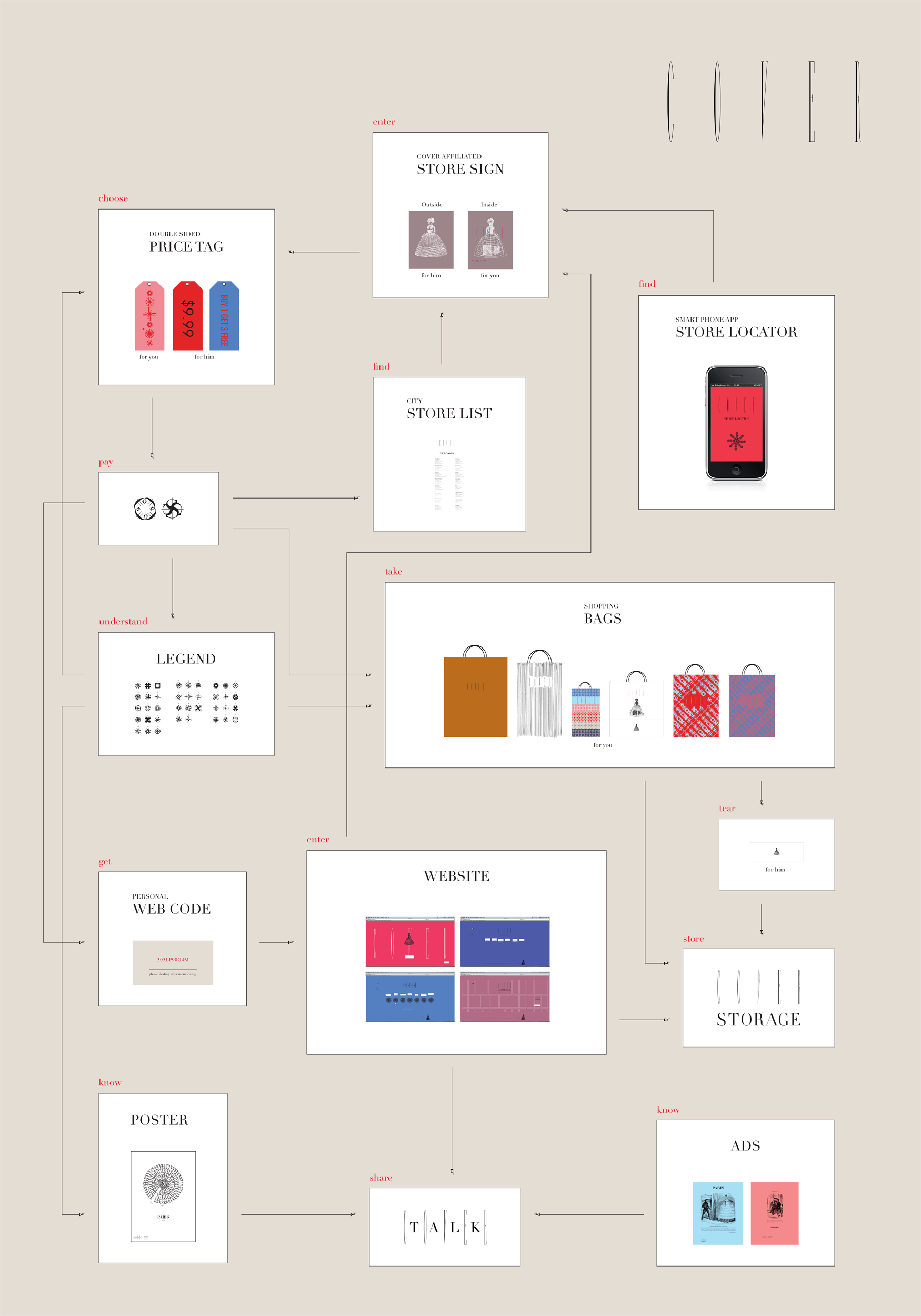
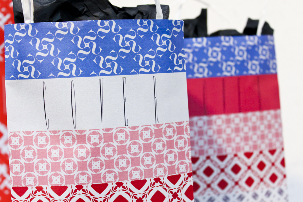
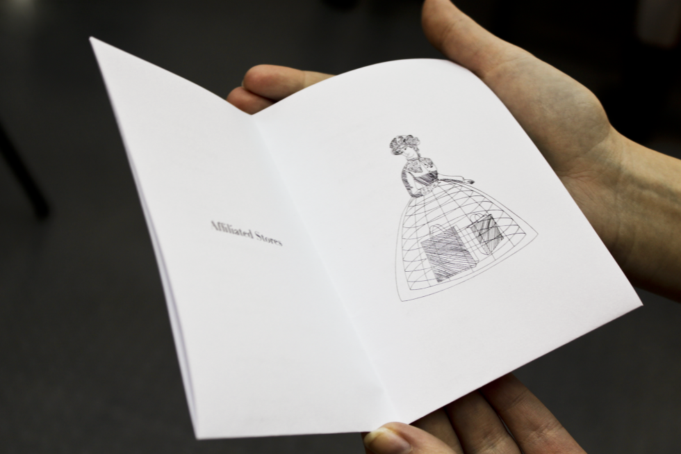
Experimental branding for COVER. COVER supplies products for fashion stores and organizes community events. The target audience is women shopaholics that hide purchases from their partners.
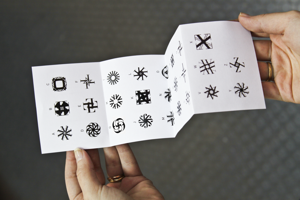
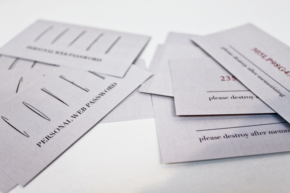
The design works in two levels – the first is what the partner understands, and the second is a level of coded symbols that the women understand. In addition to the hiding motif, there is emphasis on the community of the woman that purchase in COVER affiliated stores.
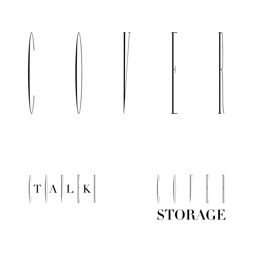
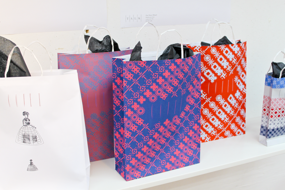
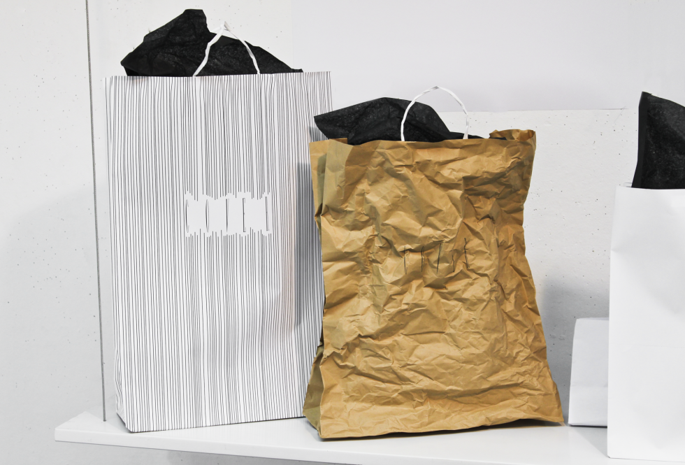
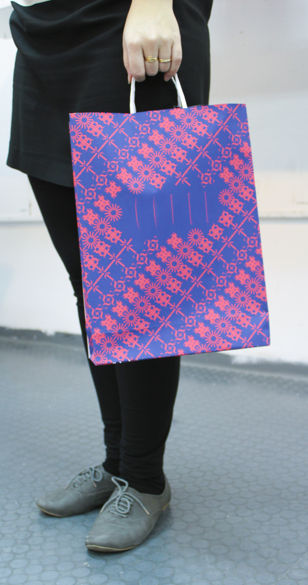
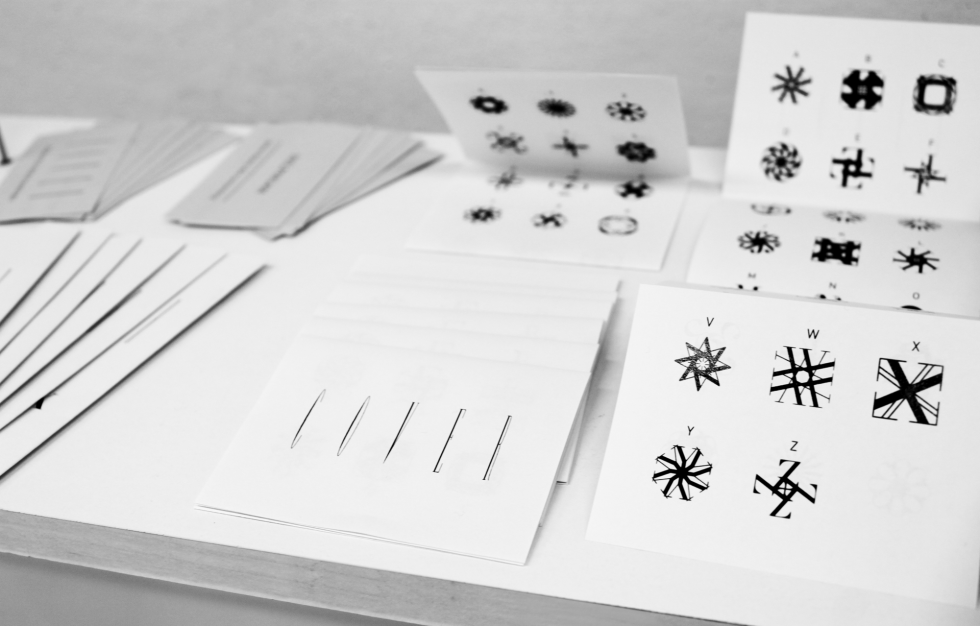
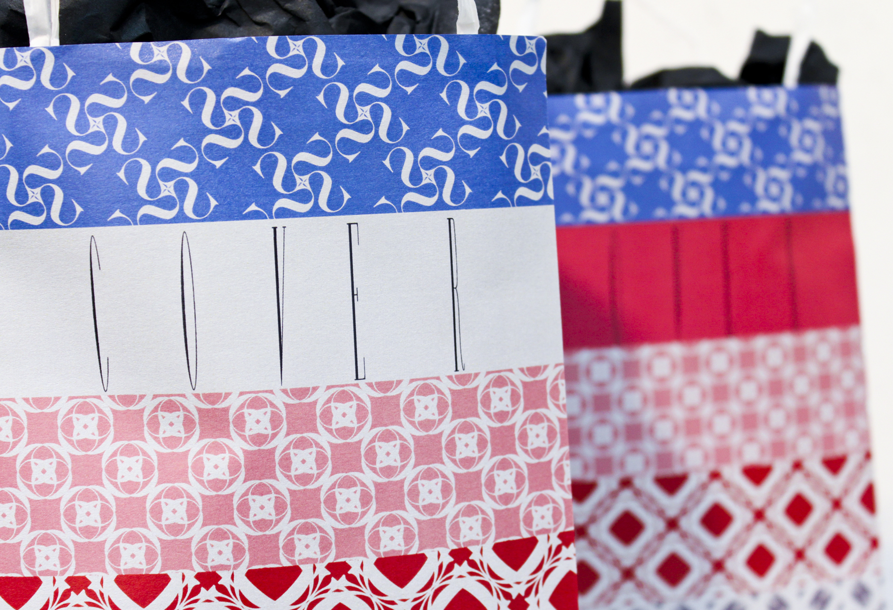
Each letter was designed in a coded way. The ornaments on the shopping bags are actually coded words that reveal what item is in the bag. Being able to recognize the COVER bag on the street, gives strength to the women’s community.
The bags are designed in a way that will make them look old, so the shopaholic can claim that the purchased item is not new.
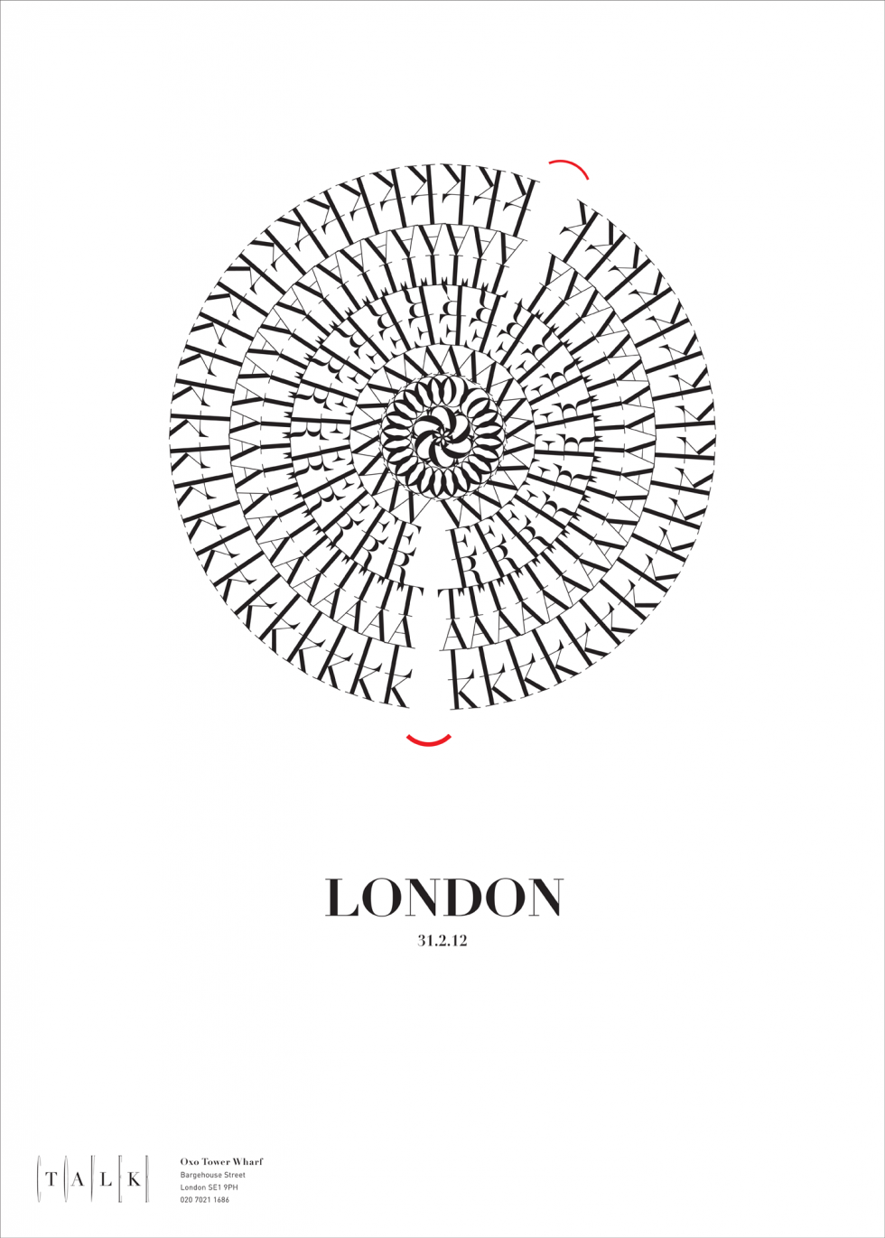
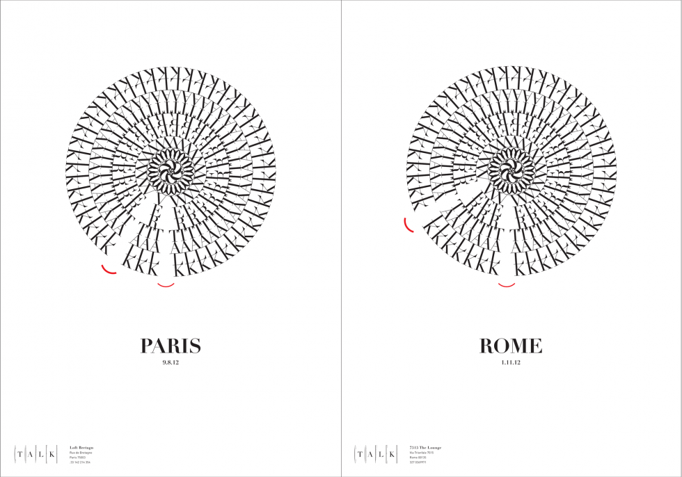
Posters for a series of ‘COVER TALKS’. The event and time are also coded.
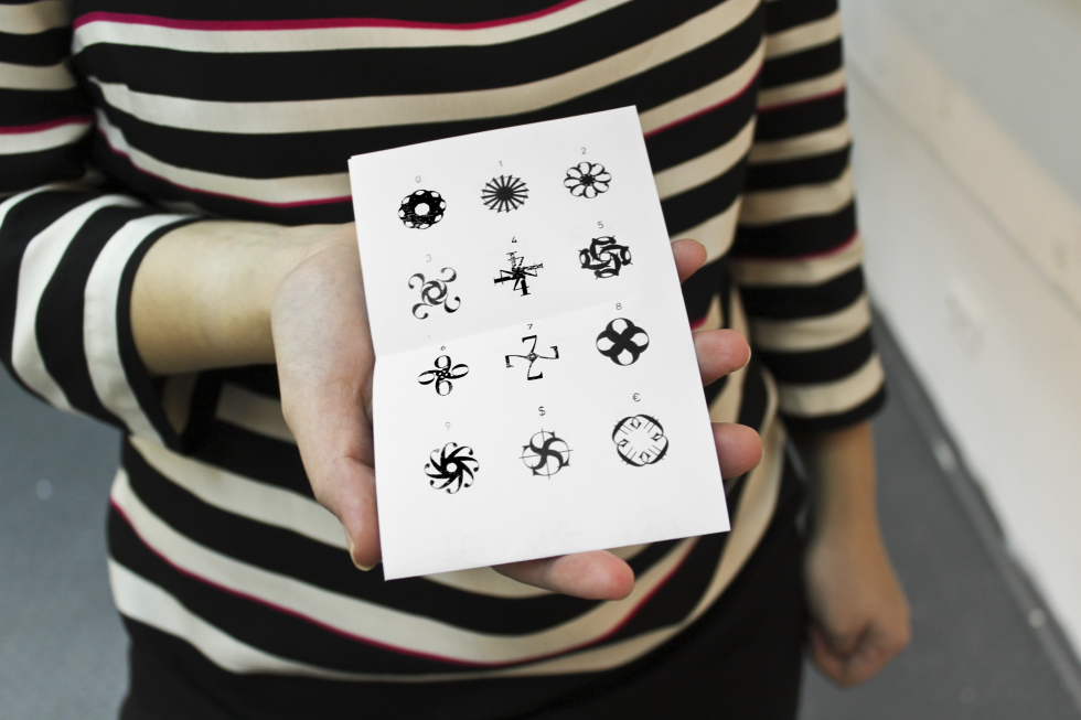
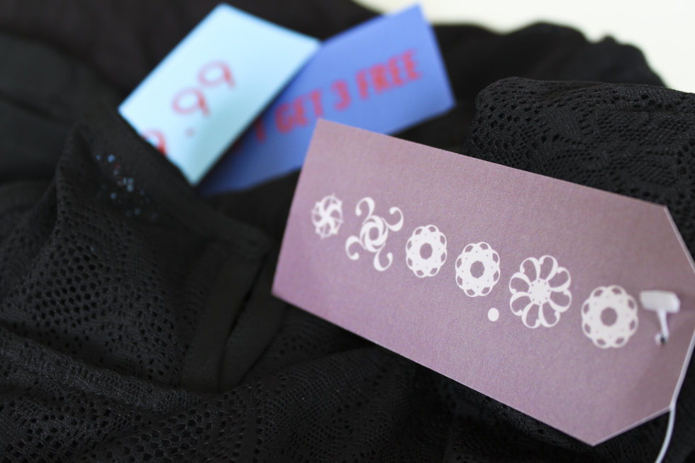
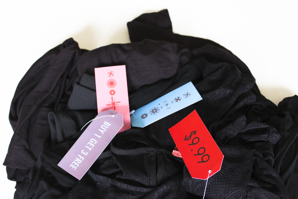
Each digit was designed in a coded way. The price tags are double sided: one side with a distraction price for the partner to see and on the other side (that for the partner may seem like an meaningless ornament) is the coded real price of the item.
